It’s a milestone that may have gone unnoticed by a lot of people, but certainly, shouldn’t surprise anyone: for the first time, in October 2016, worldwide internet usage via mobile phone and tablet, exceeded usage by desktop computers.
And for the sake of accuracy let me say again, that number represents “worldwide” usage. US numbers hover around 60/40. And while that’s shy of a majority, the percentage of mobile use is impressive and continues to grow annually.
Indeed, several factors are driving this increase, but suffice it to say it’s happening, and within the next five years — or less — a majority of US internet traffic will be mobile.
The big question that remains for so many businesses and organizations is – are you providing your clients or visitors with the best web experience on any device? Yes, any device. Not just a phone, but on the desktop, tablet, and phone.
And here’s another little nugget to keep in mind when you’re reviewing your company’s web offerings: Google is now favoring mobile friendly sites in its search rankings. While your search rankings still benefit from the great content on your website — assuming you have great content — mobile-ready sites are pulling more weight with the Google search algorithm.
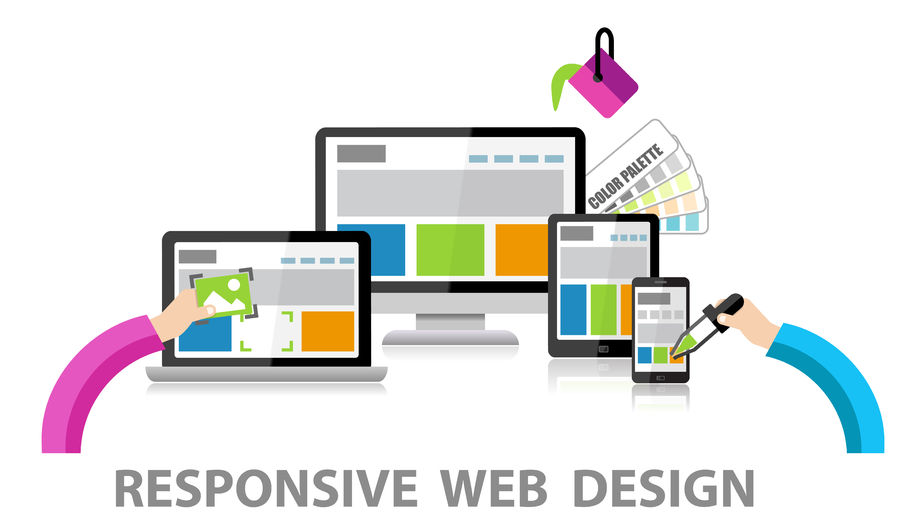
And the highest priority is given to true responsive design sites. A responsive-designed site is one that adapts the display for your visitor regardless of the kind of device they’re using – desktop, tablet, or phone.
So, just to be clear — here are two great reasons to make sure that your organization’s web properties are employing the latest in responsive design. One is that there is an ever-increasing variety of screen sizes that your website will be viewed on, and two, search results are giving preferential treatment to responsive design. So it’s not just that they look better; Google is telling us that responsive design sites *are* better.
The good news is that there is absolutely no reason why your organization’s size should be a stumbling block to your having the latest and best. Your main website, your recruitment or careers site, and your job search and apply can, and should, all look as polished and professional as those of much larger organizations. And your pages can also perform as well as the big guys do on organic searches, which can be quite a plus for all kinds of business purposes, not the least of which is recruitment.
Take a moment to look at your company’s website and your recruitment page or pages, and ask yourself these questions.
- Are we using responsive design throughout our web properties, even in our job search?
- Is our content aligned with our SEO goals?
- Is our content attracting and engaging the kinds of candidates we’re seeking to hire?
- How are we encouraging passive applicants? How are we capturing usable data about them?
- And most important of all, how straightforward and fast is it for our visitors to find the jobs they’re interested in, in the places where they want to work?
If answers to any of these questions currently yield unsatisfactory results, know that help — experienced, proven, affordable help — is just an email away. Drop us a line.
Leave a Reply